


Product signups are the lifeblood of any software as a service (SaaS) business. They are also the hardest aspect of running a SaaS business.
Unlike tangible products that a prospective customer can look at in myriad different ways, the only way to experience a SaaS product is to experience it oneself.
This makes it admittedly hard to market a SaaS product. If you are struggling to get target product signups for your SaaS business, this post is for you. Let us take a look at the top five tips a CEO should implement to boost their product signups organically.
Top 5 Tips every SaaS CEO should implement to increase product signups
One of the first things to consider when it comes to marketing SaaS products is the quality of your marketing efforts. You need to put your best foot forward and stay updated with the trends at all times. You can benefit tremendously by enlisting the help of Skale SEO agency for SaaS companies. With world-class B2B SaaS growth experts and a robust Search Engine Optimization (SEO) framework, they can scale up your product sign-ups. They employ every trick in the book to see your signups grow quickly and organically.
Let’s decode every aspect involved in growing SaaS signups and see how you can improve in each of them:


1. Keep it simple
It seems like such a bit of overstated advice but it really is important that you make everything from your marketing messages to the process of enrolling with you as easy as possible for the customers.
On average, a person is exposed to 6,000 to 10,000 ads on a daily basis. You don’t want to complicate things further for your customer who is saturated with companies trying to sell them things by making your interactions with them a chore to get through.
Simplify your approach. Include the absolutely necessary information and make it attention-grabbing. Apply this to everything.
a. Your website
As enticing as it seems, you don’t need to cram everything on your homepage. It makes it seem packed and confuses the user. Create a homepage that is simple and effective. It tells the user why they should opt for the service coupled with a sleek signup form. This approach helped GrowthRock achieve 73% more signups.
The idea is to subtly direct the user to take the desired action. By all means, put your best content and social proof there as it inherently pushes the user towards the action you want them to take, just don’t put everything there. Let the content breathe.
b. Pricing model
Pricing is a make-or-break scenario. You want it to be flexible but you don’t want it to feel confusing as well. It is even more important to keep the pricing structure simple because convoluted pricing can seem deceptive to the customer.
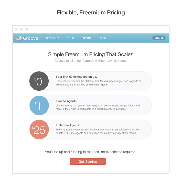
After a couple of failed attempts, Groove came up with a single price for all customers that boosted their conversion rate to 4.15% with a 25% increase in revenue. Now, this doesn’t mean this kind of pricing definitely works for every product, but simplifying things certainly helps.
c. Signup form

When we talk about simplifying a form, we don’t always mean eliminating columns. Sometimes, you do need some information from the customer to match them with a product that suits them right. For example, GetVoIP asks users some information regarding the number of employees and the features needed before directing them to the correct product sign-up.
The takeaway here is to make the process easy for the customer, not necessarily short. GetVoIP’s method may take a minute or two more, but the user understands it is to their benefit.
Be considerate of your user’s time. Include only the necessary steps. Run A/B split tests on the length of the form. Check that the form is mobile-friendly as well.
2. Let go of their payment information
This is a tricky one. On one hand, including credit card information in a trial leads to authentic customers. On the other hand, letting go of credit card information gets you more customers. It’s the classic quality vs quantity debate. The answer depends on your goal.
If you are focused on increasing sign-ups only, doing away with payment information helps you eliminate a barrier between you and your customer. It lets them know you are not asking for a long-term commitment.
If you are looking for customer retention post-trial and improving the quality of leads, you may want to include credit card information.
3. Irresistible offers

You need to make an offer to the prospective customer they simply cannot refuse. In other words, you need to tell your customer why they should sign up with you. What are they to gain by signing up with you?
You can do this two ways: offer an incentive that pushes them down the sales funnel, or offer something over and above the service itself.
a. Special offers
Skillshare often offers discounts for the first 1000 sign-ups that come through a YouTuber influencer. It helps in creating an urgency as the user feels the need to do it in the present over the fear of missing out.
Such an offer works as an incredible motivator in pushing people down the sales funnel. It gives the user a reason to sign up now as they may not get an offer like that tomorrow or perhaps even in a few hours as the YouTuber’s audience would have grabbed up the opportunity.
b. Offer something extra
Monday, a project-management tool, gives away a free template when users sign up. These offers give users a relevant and intriguing incentive to sign up for a service.
This is something extra as a reward for signing up with you. Positive reinforcement has always been a great motivator for people. So, think of this as offering your customer a thank you for signing up.
4. Loop them in with the trial
The power of trials – free or not – is not even in question today. Around 62% of companies get more than 10% of their business through free trials.
Whether you keep your trial free or paid, know that it is one of the most powerful tools when it comes to SaaS signups. Construct everything around it carefully and with the aim to increase sales.
Test the length of the trial beforehand to know what works best for the product. A 30-day trial is usually the norm but it really depends on the nature of your service.
a. Before trial
- If your trial is going to be free, make it abundantly clear. Let your customers know you mean it and there aren’t going to be any hidden costs.
- Demonstrate what they are going to get in the trial. Applications like Photoshop give access to all features in their free trials while some SaaS products hold back on some features.
b. During trial
- The customer should not feel as though they have been left on their own upon taking up a trial. Walk them through it if need be.
- Provide constant telephonic or chat support at all times. Let the customer know they can approach you at even the slightest inconvenience. Customers tend to prefer live chat over other support methods.
- Pitch the paid service at the end of the trial.
c. After trial
- Don’t forget to get their feedback and let them know you appreciate them trying it out.
- Pitch the paid service again, coupled with an offer if you can.
5. Social proof and killer content are the keys
All technicalities aside, people are more likely to be persuaded to try out your service when they see other people doing it. We talked earlier about keeping your website clean. The two things that will benefit by being on your homepage are social proof and content that persuades users to purchase the service.
Social proof can come in many forms, it can be testimonials and product reviews from your previous clients, or client logos, or a simple social counter that lets the user know how many visitors, likes, and comments a piece has had. They reassure your users about your legitimacy as a business.

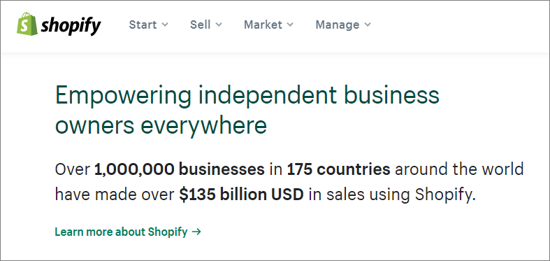
Put simply, they establish you as someone worthy of their time and money. For example, Shopify makes sure to showcase how many businesses it has helped using absolute numeric terms to establish its prowess in its field.
The same goes for the content you create and especially showcase on the homepage. It should be about educating the user how your service will help them, why you are the ones they need, and what they can expect once they sign up.
Most businesses often forget that last point. Letting the users know what’s on the other side of signing up is just as important. Just like social proof, it helps establish your legitimacy and gain the prospective customer’s trust.
Conclusion
At the end of the day, it’s about setting your goals right and working towards achieving them. You may simply want to increase signups, or you may want to increase the quality of the leads you are getting. The above tips are sure to help you with all that and more.
Let us know in the comments section below what tips you found useful and what you do differently to increase your SaaS signups.
Guest post courtesy of Zoran Naumoski