


Designing a logo that engages your target audience and communicates your message isn’t an easy job. You may look for ideas and inspiration for days and still don’t find something eye-catchy. You can analyze the creative work of competitors, website designs, different emblems, or even superhero logos.
On the other hand, you can’t ignore the elements of a logo design. These elements complete a design and make it attractive enough to draw attention. One of the trendy elements is gradient. Gradients were popular to incorporate colors and depth into a design.
Using gradients in a logo design became a prominent design trend. However, flat designs took over in the late 2000s. We saw gradients making a comeback in 2018. You can see them everywhere, even to enhance flat designs.
Famous logos, such as Instagram and Airbnb, opted for the gradient to make their logos successful, and you can try it too.
But first, we need to know:

What is a Gradient?
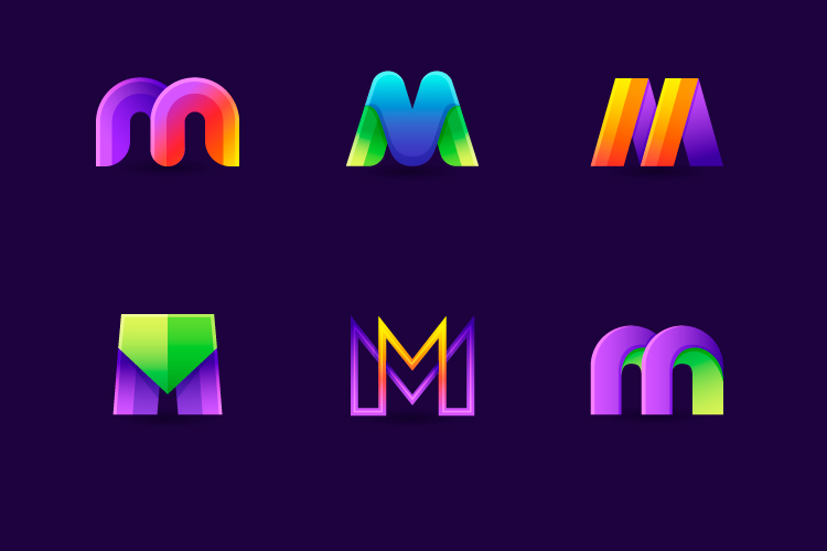
As mentioned, a gradient is a design element that enables colors to fade into one another. There are other terms for it as “color ramps” or “color progression.” Gradients consist of various shades of a similar color or multiple colors blended.
Using gradients in a logo design doesn’t mean incorporating several colors in one design. It’s done to blend colors and allow each shade to transition into the next, producing a cohesive effect. You can find different types of gradient colors, such as radial, reflected, linear, conic, or diamond, etc.
Reasons to Use Gradient Effect in a Logo Design
Gradients are your best friends when it comes to accenting a solid logo. You shouldn’t use them to hide a weak design. Since gradients are effects to improve your design, there’s no need to make it a selling point of your logo.
You can opt for it to add an extra flair to your design. However, there are other reasons to use gradients in your logo design.
To Run an Online Business
If your business is internet-based, gradients may work well for you. Gradients go well on the screens than print materials. Therefore, think twice before choosing a gradient effect for offline branding.
For example, a flat design is suitable for a restaurant logo as you put it on menus, napkins, and storefronts. On the other hand, you can freely incorporate gradients for two reasons: to stand out in the competition and be known for your compelling logo.

To Maintain a Creative Vibe
As mentioned, your logo design needs to align with your brand identity. You can achieve it while maintaining creativity. Gradient logos look unique and eye-pleasing, especially for businesses in arts or innovation.
However, suppose you want to appear as a company that offer one-of-its-kind solutions for their audience or customers. In that case, you will need a logo that communicates creativity to your audience.
To Achieve Relevant Brand Identity
Regardless of its type, it’s essential to focus on the vibe you’re trying to create when designing a logo. Did we mention that gradient designs are a vibe unto their own? Logos with gradient effects implies creativity, innovation, and imagination.
For example, famous gradient logos belong to the tech industry. These companies were looking for ways to pop out, and gradients are perfect for doing that. Be it a Firefox logo to Facebook messenger’s; you can see why the brand opted for a gradient effect.
To Stay Alive in the Minds
Have you ever noticed the objects in nature how a single color shade doesn’t characterize them? For instance, trees offer a compilation of greens, oranges, and browns; dirt transitions into blacks, browns, and reds.
In simpler terms, our eyes are accustomed to seeing gradients more than flat designs in our surroundings. It means having a gradient logo can help keep your business alive in the minds of your audience.
Do’s and Don’ts of Gradient Logo Designing
Gradient effects don’t go well with every brand’s aesthetic; it’s essential to consider them before incorporating them into your design.
Here are some of the dos and don’ts of creating a logo with gradient effects.
Do’s
- Consider contrast and accessibility when designing a gradient logo.
- Use gradient only when a design is well-thought-out and blends with your brand.
- Optimize your gradient logo design if it will be used on the print material.
- Focus on punctuation and accent marks when working with gradients.
Don’ts
- Don’t judge the accessibility of the gradients by yourself. Ask friends or family if the design is straightforward.
- Don’t opt for a gradient if the design is created without any thought.
- Don’t forget the significance of readability and print quality at various sizes.
- Don’t go for a gradient design if it is not suitable for the font.
Over to you
No doubt, adding gradient effects can elevate the aesthetics. However, you need to focus on functionality, readability, and print quality as well. On the other hand, you need to look for inspiration when creating a gradient logo.
Try testing different colors and styles before finalizing anything. More importantly, be clear on where you will be using the logo and ensure that gradients align with the branding and marketing strategies in the future.

