Think of a tarpaulin or a poster found next to a basket of fruit being sold, or marketing materials latched onto the shelves at the supermarket. A booth that carries the branding of a product is also considered a POP display. These are called point-of-purchase (POP) displays.
POP displays are visual marketing materials found at places where consumers make their purchasing decisions. They are incredibly versatile, ranging from product packaging to a tower of products in the middle of the mall.
They differ from point-of-sale (POS) displays because POS displays are commonly found near the cash register or other locations where consumers actually buy the product. So, the essence of POP displays is to facilitate decision-making among consumers, which should be the target of marketing teams and graphic designers.
Why are POP displays important?
POP displays play a significant role in marketing because they catch the attention of the consumer. Through POP displays, consumers consider buying the product, with several reasons potentially influencing their decision:
Attractiveness
Sometimes, it’s all about catching the attention of consumers. When a product has their attention, it can pique their interest, and this could lead to purchase.
POP displays give an avenue for brands to be creative with their marketing. Other than shelf display, brands can strategically find a location where they can get more attention and chances for people to purchase the product. For example, a chocolate bar brand can set up a dump bin at a place where children would usually be around. They can also have a display at a gift shop or together with other gift baskets.
POP displays can attract the attention of customers and remind them about a product. They may not have considered picking up the product while passing through the aisle, but they may reconsider when they see it in freestanding units.
Cross Marketing
Planning how the POP display can appeal to consumers involves a lot of factors. One of them is location. Cross-marketing is about hinting at the consumer that they need the product with another product.
If a person needs a pencil, they will need a sharpener. So, setting up a POP display of a sharpener next to pencils would be smart. Other pairings are wine and cheese, cameras and travel essentials, and hair treatments and skincare. Not only is cross-marketing smart, but it also doesn’t cost much.
Consumers, while shopping for things, tend to pick up items related to their primary purchase. By suggesting the relationship between certain products, you create a reason for consumers to buy related products as well.
Product Interaction
The creativity in POP displays is endless, especially for creating an experience for consumers. The unpacking experience can be leveled up by a little extra step through packaging. A fun slogan on an exclusive vending machine can call out to the consumers’ needs and catch their attention. Consumers can play a game or take a quiz to help them decide which version of the product suits them the most. These are just a few ways of utilizing POP displays to help with marketing.
The purpose of these strategies is to help consumers realize why they need the product. It allows them to interact with the product and how it applies to their life. These interactions attract consumers by giving them an experience. So, from a straightforward “Buy me” call to action, POP displays engage consumers’ interests instead.
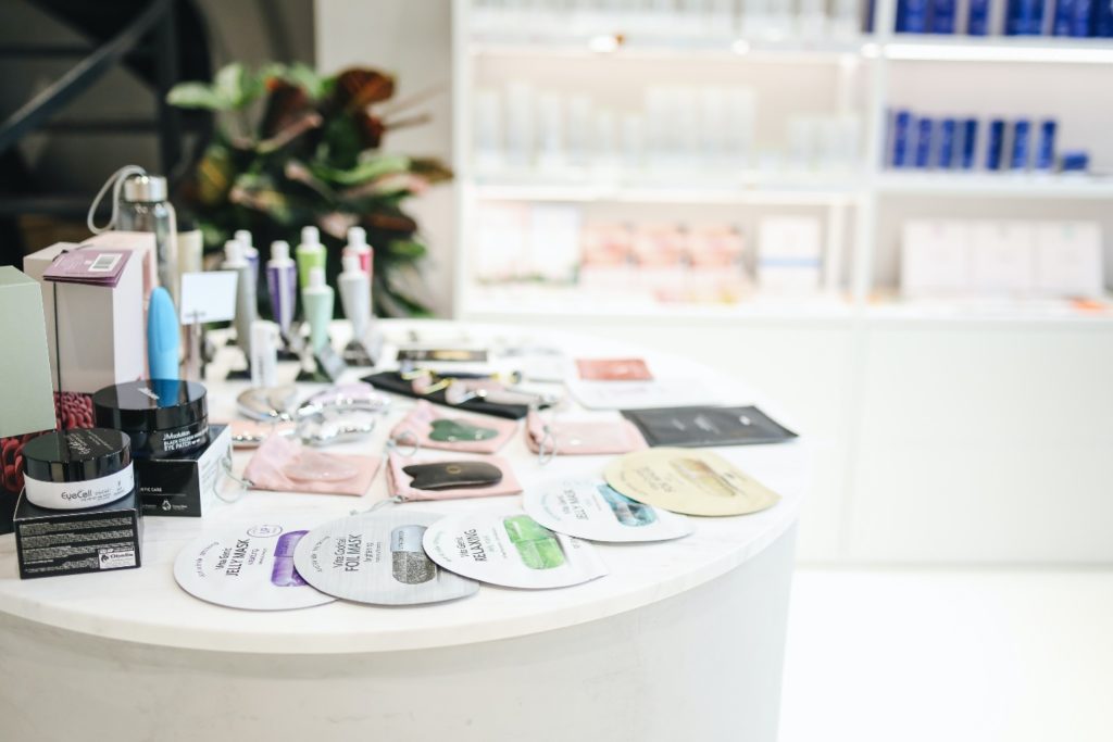 Photo by Polina Tankilevitch from Pexels
Tips for a Successful POP Display
POP displays come in many forms. They can be in dump bins, inside crystal displays, banners, or a simple stand. The challenge is to make them memorable and effective. Here are ways to make a successful POP display:
1. Relate to your audience
Catching the attention of a target audience requires relating to them, and this needs to be emphasized in the POP display. An effective way to do this is by incorporating imagery that appeals to them and is consistent with the product. The imagery should also convey the message the brand wants to get across.
A Barbie POP display that wants to tell kids that they can be anything may use images of Barbie being an athlete, an astronaut, a journalist, a pilot, and so on. Barbie already appeals to their target audience, which is children. Showing her in different professions emphasizes the message the toy wants to tell its audience.
2. Stay relevant
POP displays are not a one-time-big-time kind of thing. As times change, so should the display.
Different seasons suggest different things. Ice cream sounds great during the summer, but it’s not the same in the winter. Months also have recurring themes, like Pride Month for June and Valentine’s Day for February. Therefore, marketing strategies should vary.
Brands can be witty by using wordplay in their slogans. They can also use popular symbols to highlight imagery. Hearts for February, for example, and sun for the summer.
3. Think out-of-the-box
Don’t be confined to regular shapes and sizes. If there’s anything that catches people’s attention, it’s the unconventional things. A POP display for a bag of oranges comes with a marketing material shaped like a tree. A seafood snack used a crab cutout to emphasize its message and story. Taking an image from your product and using it as the main attraction of the POP display does not only show what the product is about, but it also reinforces branding.
4. Use technology
Whether it is a simple button, a tablet, or a whole machine, technology makes everything more interesting. A POP display can tell a consumer to press a button, and they probably will out of curiosity. A tablet with a quiz adds to the interactive experience of a consumer. When consumers find a massive machine in the middle of nowhere, they think it’s eye-catching and see the product even from afar.
When it comes to leveling up the interaction and the experience of a consumer, you can trust technology to do the job. Technology has come far enough to keep up with people’s creativity, so have fun playing around with it—as your audience will, too.
5. Place the message at eye level
Consumers shouldn’t have to look around to know what your POP display is all about, so the best place to put it is at eye level. It’s a straightforward location, and people can easily find it from a distance or when they’re simply passing by. This increases the chances of catching consumers’ attention and drawing them into the display.
Additionally, having your message at eye level is accessible. Consumers don’t have to bend or tilt their necks way too much.
6. Aim for branding consistency
The best way to be recognizable is by being consistent with your branding. When consumers spot the display, they should be able to tell right away that it’s your brand. This could cause them to gravitate towards your products, or it could be their “I finally found it” moment.
Most of all, branding is an identity. It’s how people remember the company and its products. By the time they become loyal consumers, the branding is engraved in their heads—and this is great for any brand.
7. Think packaging, packaging, packaging
Speaking of branding, one of its crucial components is packaging. Because branding is the company’s identity, the product should champion it wherever and whenever it may go. From a financial perspective, good packaging increases the market value of a product, as it did to Nabisco in 1979.
But packaging is not just about value. Product packaging can also be a marketing tool since a huge part of it appeals to the consumer. Packaging contributes to the unboxing or unpacking experience. When done right, it serves customer satisfaction well. The packaging also communicates important information to the consumer. Is it non-fat? Is it organic? What is this item?
So, practically speaking, packaging elevates the interaction of the consumer to the product. It’s the primary form of communication of the product to the consumer. Not to mention, it attracts the attention of the consumer and sends visual signals to the brain.
8. Have good graphic design
Photo by Timothy Exodus on Unsplash
Good graphic design is more than just aesthetics. It’s about functionality, convenience, and communicating with the audience.
Take, for example, putting the message at eye level. Graphic designers commonly do this because it’s practical that the audience sees the message right away. They also use a huge and emphasized typography to highlight the text.
Another way they communicate with the audience is through using colors and imagery. Red is for excitement, passion, and energy. Blue conveys safety and trust. Yellow represents happiness and vibrance. Art designers combine the specific use of colors with the right imagery to visually market the product effectively.
Make it POP!
Think of a POP display as a pop-up. It could be in the middle of the supermarket or dangling by the shelf. Wherever it is or however it looks, it’s still a potentially effective method for visual marketing. It catches the attention of consumers, enhances their experience with the product, and convinces them to make a purchase.
To maximize their marketing benefits, brands should be creative by taking advantage of good graphic design. This will result in appealing imagery, good product packaging, and convenient placement of important information. Since POP displays are visual marketing tools, the aesthetics of the materials are highly significant.
Guest post courtesy of Michael Dillon













 |
|